I keep wanting to type Covert Art…
For the past few days, I have been obsessed with filling out Cover Art and Cover Copy forms for Penny’s single title erotic romance coming in the fall from Samhain Publishing. I’m very glad to report they are now in the hands of my editor.
Filling out Cover Art and Cover Copy forms sounds very exciting to an unpublished writer, and it IS exciting, even though I’ve been through it several times. I love to feel a part of the process of making my books come to life. But filling out these forms can also be nerve-wracking. I want to get it right. Because what I write down helps the art department and the story blurb people work with a vision that might otherwise remain in my head.
I write under two names and have worked with four publishers so far as Cindy and two publishers as Penny. Every publisher wants the forms filled out a little differently. Some forms are more challenging than others. However, not all publishers use the information on the forms, or they use it in a different way than you, as the author, might envision. Which isn’t necessarily a bad thing. Just because the author writes the story doesn’t mean she’s the best person to decide on cover art.
In the case of Penny’s three novellas in print anthologies, the cover art has to reflect an overall tone for the four stories within each volume, not for one of the four individual stories. So, for me, the Red Sage author forms were easier to fill out. I considered it a marvelous fluke that the couple on Penny’s first anthology just happened to have the same hair color, etc., as the characters in my novella.
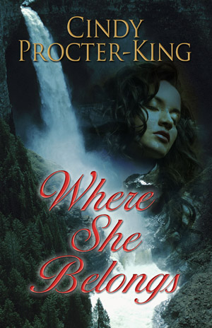
For WHERE SHE BELONGS, coming from Five Star Expressions in December, I wrote the cover copy, but I don’t know how much it will be massaged. I’m eagerly awaiting the final results.
This is sort of a scatterbrained approach to describing how authors go about filling out Art Fact Sheets, as they are often called, and Cover Copy Forms. Sometimes I need to provide a tag line, a short blurb and then a longer blurb (like you would find on the back of any romance novel). In the case of HEAD OVER HEELS and BORROWING ALEX, the blurbs appeared on the books exactly as I wrote them.
When I first saw the cover of HEAD OVER HEELS, I was ecstatic. I thought the artist did an excellent job of portraying the tone of my story. Whereas the cover for BORROWING ALEX had to grow on me. My initial reaction was that the cover art made the book like a romantic suspense. Sure, it has a kidnapping, but it’s a comedy. I talked about it with my editor, and she was able to allay my fears. After all, how many romantic suspense novels have pink covers? And the guy on the cover certainly looks like Alex, the hero of the story. The other elements on the cover are all included in the story.
No readers have complained that I gave them a romantic comedy packaged as a romantic suspense. So, it turns out, the cover artist did know what he was doing. I love the cover now.
Well, I’m not doing a very good job of describing the process, am I?
For those who aren’t writers, the Cover Art form might ask you for your synopsis or a shorter version (and then you have to write it—ack!), descriptions of the hero and heroine, descriptions of important scenes in the book or elements you might consider important. Do you hate covers where the hero’s head is cut off? The Cover Art form is the time to mention it (I love what I call “body part” covers myself, because they allow my imagination more rein). I always, always, always, include pictures to show an approximation of how I see the hero and heroine in my mind. For WHERE SHE BELONGS, I included pictures of the fictional setting (well, the real town and area on which Destiny Falls in the book is placed). Because the book is set in rural British Columbia and Five Star is in the Northeastern U.S., I felt it was important to show the setting on the Cover Art form. Whether the setting is used in some form or other on the cover remains to be seen. Just in case, I wanted to get in my two cents.
Some publishers also ask you to include links to or pictures of covers either from their publishing house or other publishers that you feel convey the tone of your story. I love doing this, although it takes a lot of time. But artists are, naturally, visual creatures, and providing pictures helps them.
However, in the end, the decision is up to the publishing house, not the author. We have input, but we don’t have final say. Unless you’re self-publishing AND creating your own covers as part of the process (rather than hiring a cover artist), describing your characters and tone of story and providing examples of what you might like to see is often the author’s one and only chance for some say in what her book looks like. If you hate the cover, it’s not often you get a chance to rectify it. Horror stories abound of an extra arm appearing on a book cover, or a cartoon cover that reflects a comedic tone when the book is really ultra-emotional. 99% of the time, the author just has to live with it.
Okay, class, time for break. My Peanut Butter Cup is at the ready.
Any questions?
