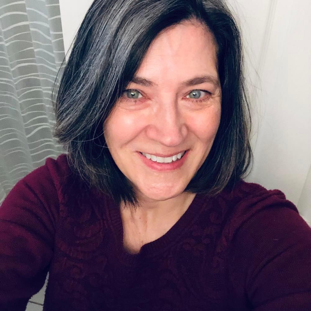
So, this is what’s going in the back of the Love & Other Calamities Romantic Comedy books:

Yeah, I took my author photo in my bathroom! With my phone.
It’s in black and white in the books (unless a reader reads on a tablet with colour), and it looks fine. Good enough! Until I can set up the “big camera” and take proper self-author photos for my new website.
But my website is still old, and when I imported the picture into the new home page, it looked weird. It was suddenly obvious that’s a shower curtain behind me.
A couple of YouTube tutorials, and this is what I’m hoping to pull onto the home page instead:

Not bad for my first time using Affinity Photo. I like the blue behind me. I managed to accidentally cast a shadow. A splash of over-exposure and it’s not so obvious that I’m, ahem, mature.
I like my Cruella tinsels.
Wish me luck getting the new website pages built!