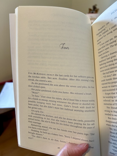
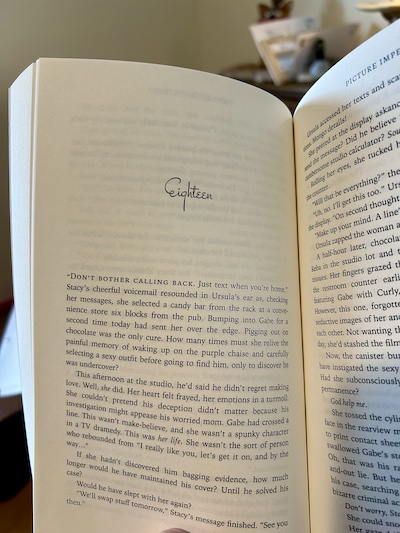
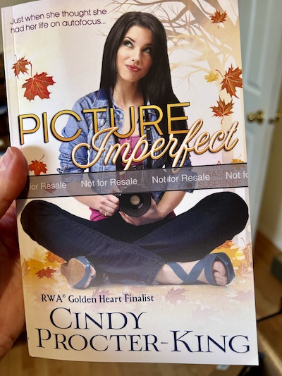
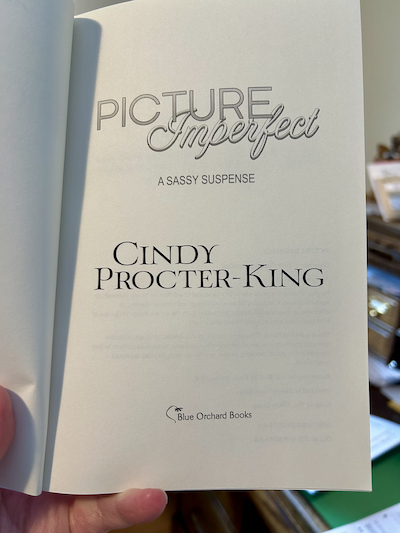
Formatting a book for print, that is.
Actually, I’ve never formatted an eBook, either. I usually farm out my work. But this time I’ve decided I should learn to format myself. It makes updating files so much easier. For some unfathomable reason, I decided to start with print formatting.
CreateSpace has templates for use with Microsoft Word, and it would probably be a lot easier if I just downloaded one of those templates. Only problem is, my copy of Word is so old (the 2003 edition) that I can’t save as PDF, which I need for uploading to CreateSpace. And…years and years ago, when I built this site and my pen name’s site, I decided to upgrade my Dreamweaver and PhotoShop. They came combined in a program called Adobe Creative Suite 2. Creative Suite has since updated to a cloud-based service, but for someone like me the $20 U.S. a month when I only put out maybe two books a year (that’s being generous, LOL) isn’t worth it. And I don’t design my own covers. So, being the obstinate sort, I decided to try learning how to format my print interior pages with the very old InDesign CS2. The problem? Back when I was buying how-to books for Illustrator and PhotoShop, I didn’t buy one for InDesign, thinking I would never need it. Now, there are a lot of great free templates available for InDesign book interiors, but try finding one for the CS2 version of the program. So, instead of downloading a premade template and creating my book from there, I’m building the template from the ground up. Thanks to YouTube and Google, there are a lot of places I can go for help, but the set-up is never quite the same because, you know, Cindy has old software. This might take me awhile…
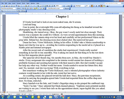
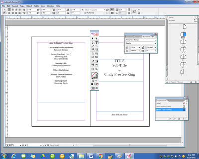
Just to prove I’m really at work, here’s a shot of Page 1 of PICTURE IMPERFECT in my Word doc, followed by how far I’ve gotten in InDesign (I finally created page numbers on my Master pages, but they aren’t starting in the right spot. My next challenge is creating running, alternating page headers.)


The idea is that once I have the template down pat, I can use it for future releases as well. And, if you can read Page 1 of the Word doc, that’s the world’s first peek into PICTURE IMPERFECT! (Which will go up for pre-order just as soon as I’ve got the cover commissioned).
Yup, I need to create a new website page for the book, too.
